Access refers to the visual cues that help a reader navigate and understand your writing. Adding access can be as simple as adding bullet points or numbered lists, or it can be as complex as adding flow charts and large illustrations. Consider your audience when choosing access: a good visual can go a long way toward helping an amateur understand a difficult concept.
For example, if you need to explain a term your audience might not know, consider using a sidebar, so you don’t break the flow of your text. Using sidebars also gives expert readers the opportunity to skip information they already know.
It’s also important to consider your audience, as well as your purpose for writing, when designing visuals for your document. Below are a few commonly-used examples of visuals for academic documents:
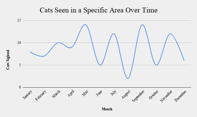
Line graphs show change over time.

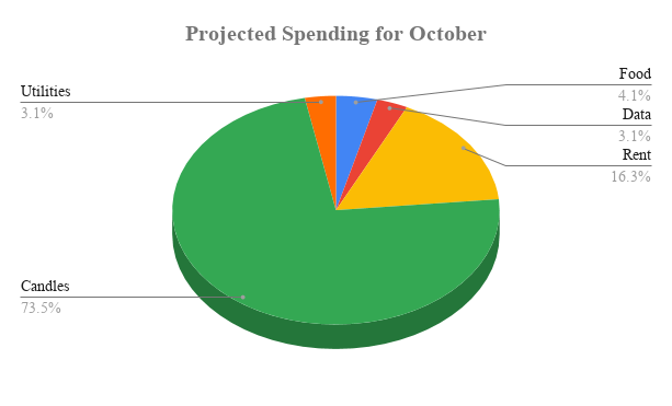
Pie graphs show pieces of a whole.

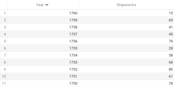
Tables organize numerical or verbal data.

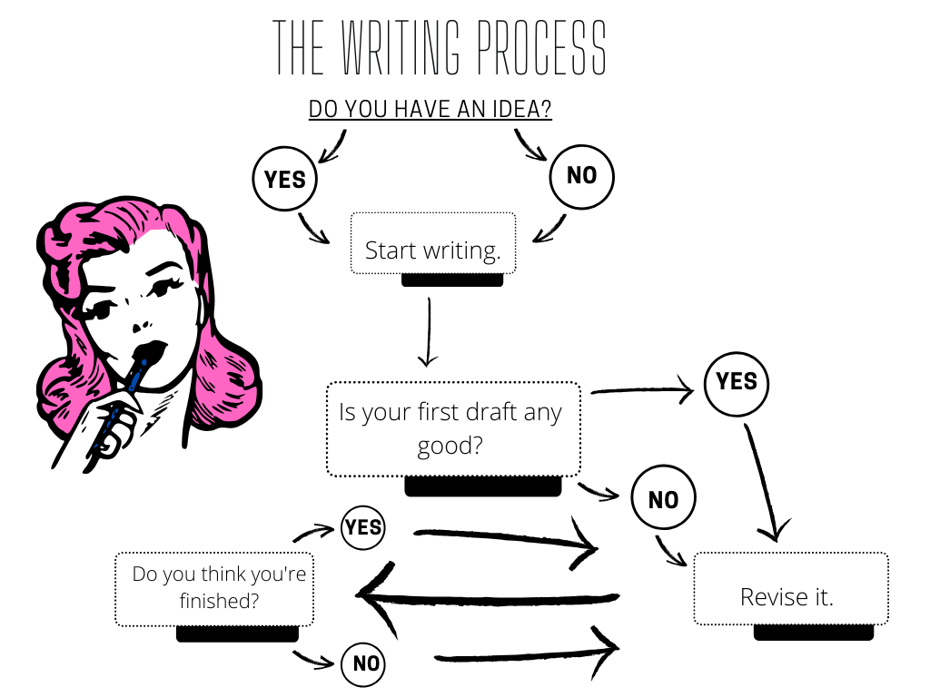
Infographics combine multiple visualizations for a general audience.

Additional Resources
Unsplash – A huge repository of high resolution photos that can be freely used in any project, no permission required.
GIMP – If you don’t want to buy Photoshop, check out GIMP. It’s a free program for manipulating graphics that can fulfill many of Photoshop’s functions.
Canva – A website that allows you to make large infographics easily. Infographics can be useful for summarizing the findings of reports and presenting all kinds of data visually.
Snappa – A visual design service that is run completely online. You can pay for a monthly service, but a free account offers over five thousand templates to use.
